Interaction Control Library:
A Design System for Scalability
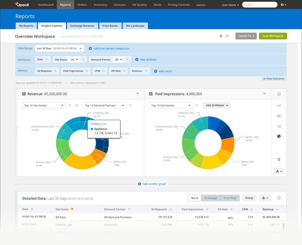
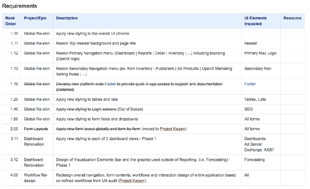
Stage 1: Reskin – Transforming the visual aesthetic for the modern age
The overall story of my time at OpenX, is one of design transformation. Through my tenure, I drove an uphill climb from taking an antiquated B2B application with custom, individually constructed UI to a more automated, Angular JS-based application built off of a UI library of crafted objects able to be constructed by any developer.

Design Principles
Our Designs are Defined by our Customers. We aim for designs that build confidence and differentiate us in the marketplace. Our designs are focused on increasing revenue for our customers and ourselves by reducing resource costs associated with ad trafficking and reporting or increasing the efficiency with which campaigns are managed.
Clear and Consistent.
Never lose sight of the forest and realize that consistency across the entire platform matters.
Details Matter.
Design aesthetics are a touchstone for our products – they look and feel superior and professional and they do this through simple, clear and personal details.
Adaptive.
We create scalable solutions for all user types from self serve customers with no knowledge of ad tech all the way to the most sophisticated ad ops manager.
Question Everything.
In every design, it’s important to be clear on the business goals and understand the problems. It’s also important to know what questions to ask to verify if a design works.
Stage 2: Establishing an Object Library
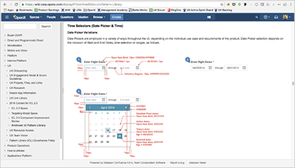
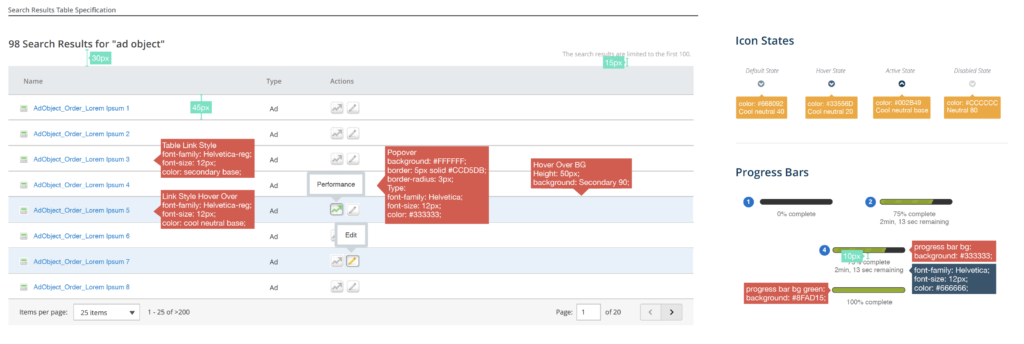
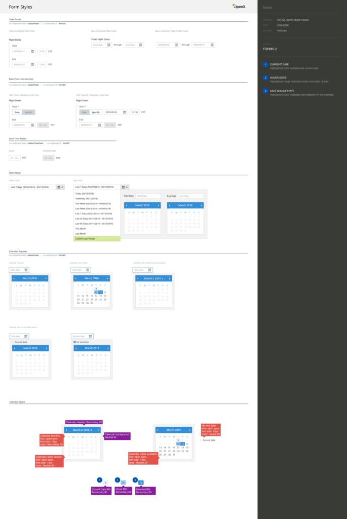
Identifying and specking the core reusable objects in our platform.
Stage 3: Building a Comprehensive Research Practice
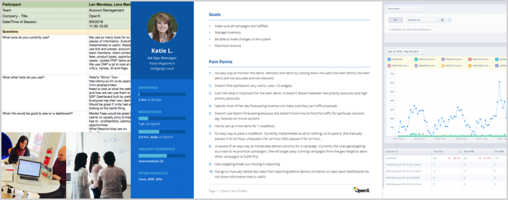
Going from no mandate for user research, to a full service internal and external stakeholder research practice with a complete suite of tools, repeatable processes and methodologies utilized on numerous projects by the design team.

Stage 4: Pattern Library – Building our Lego Bricks
Research tells us what we need to build, but not how to build it. The costs of re-architecting is high and developing new designs to be built is complex. By developing a structured framework of UI objects, new features can be developed quickly and UX can spend more time focusing on building the right things, the right way. Reduce the time cost of design, and the time cost for development by creating our own toolkits built from our own “Legos.”
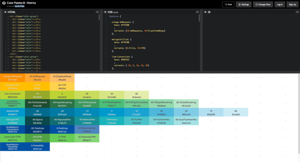
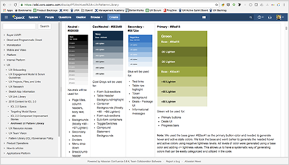
Establishing color patterns based on our brand colors rendered as Sass colors in UI
Creating object oriented templates for archetypal page types for Designers, Engineers and Product Owners to utilize in product requirement documentation.
Stage 5: The Interaction Control Library (ICL)
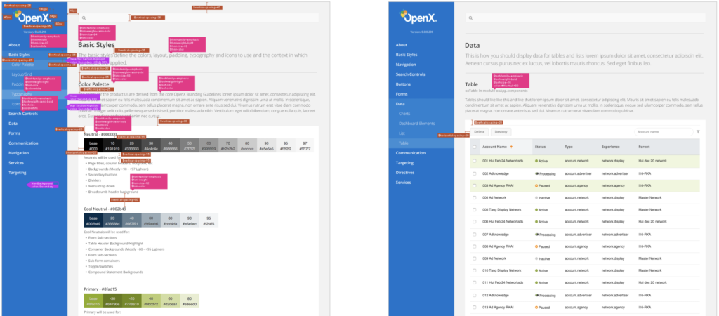
The UX and engineering teams worked together to take the design patterns and build out a stand-alone minisite dedicated to UI demos with code samples. This site featured real-world samples of each object, tied to production code. So any changes to these objects would be mirrored in the platform. In order to take full advantage of the patterns, the UI platform layer needed to be converted to AngularJS.
We developed component governance policies to empower designers, engineers and product owners to understand when to use each component and how. As the user interface evolves and extends, there will be a need to make modifications to components and/or create new components.
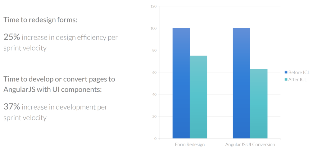
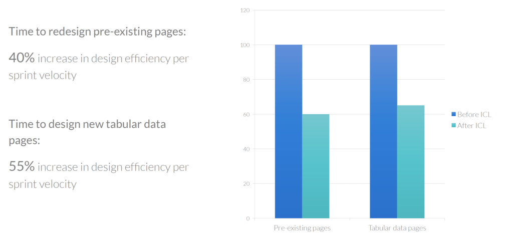
Results
The UX and engineering teams worked together to take the design patterns and build out a stand-alone minisite dedicated to UI demos with code samples. This site featured real-world samples of each object, tied to production code. So any changes to these objects would be mirrored in the platform. In order to take full advantage of the patterns, the UI platform layer needed to be converted to AngularJS.
