Social Media Content Sharing Platform
LoveIt is a Pinterest style service with power tools for discovery, organization of, and collaboration around, anything visually inspiring online, designed with monetization of visual bookmarking in mind.
The LoveIt mobile platform capitalized on the pre-existing web framework for the social network but employed specific interactions and design concepts unique to the mobile framework to allow for increased engagement, easier user-generated content population and faster browsing.
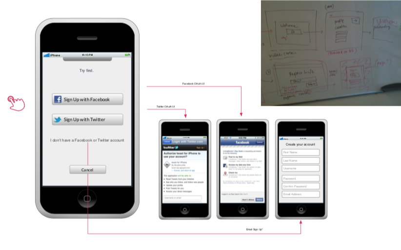
The most important interaction in a social app is conversion through onboarding and in order to give users the most robust experience required lengthy onboarding process. To find the proper mix of ease and speed with capturing enough data to give users a useful presentation of content, we needed to make many fast changes and test different permutations. As such we needed to be able to run user tests, funnel users into experiments, and make quick changes without submitting the app to be approved each time. I developed a single- page scrolling flow as a browser-based experience, easily modified on the server-side.
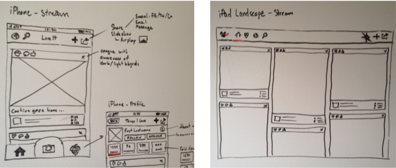
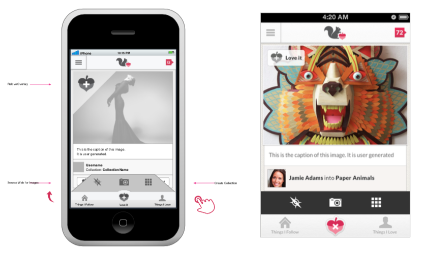
The key interaction of the LoveIt app was the LoveIt button, which activated an action menu of options to add content from a browser, a camera, or the native photo album. To activate the menu, an animated microinteraction was developed to “fold” the menu up from the main menu when activated to give the app some added depth, seen here in wireframe and final visual design.
The LoveIt Android app predated Material Design’s cohesive language on Google’s apps and as such needed to adhere to multiple device and OS types.
It took on specific design elements, such as button shapes and modified navigation to account for the back button, but was more or less a straight iOS port to Android. This decision was also done for time and budget reasons. A more comprehensive Android strategy was preferred but abandoned.
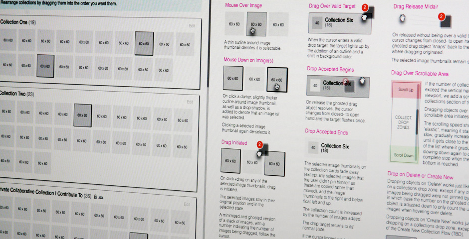
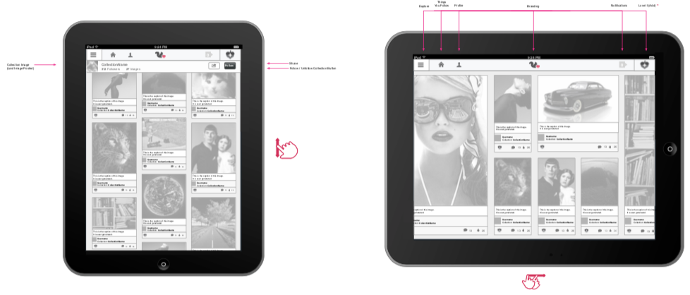
Through user observation on a variety of app types and device orientation, I had recognized that on a full size iPad or tablet, it was more comfortable to scroll up and down in portrait mode, but less natural in Landscape and therefore easier for users to review content by scrolling left to right in Landscape mode. To accomplish this user experience enhancement, the algorithm had to be recalculated and rewritten to accommodate the tiled images in various shapes and sizes presented in logical chronological order. Ultimately, this small change lead to a breakthrough in the overall application design and purpose.
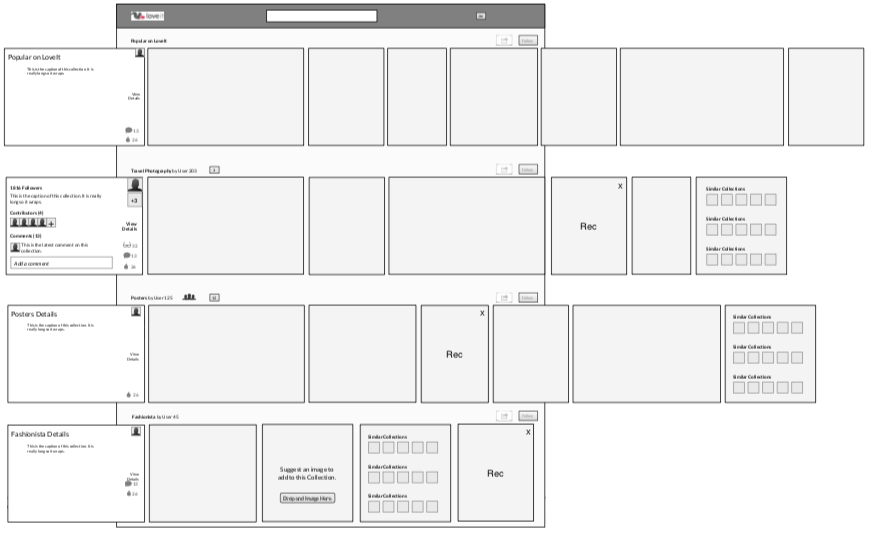
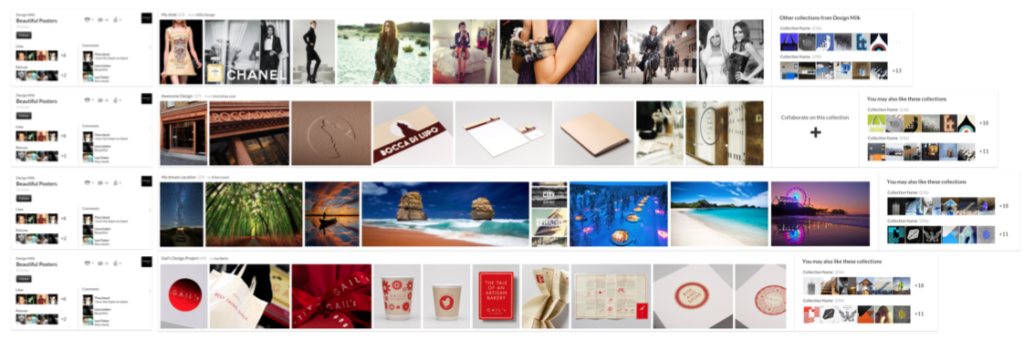
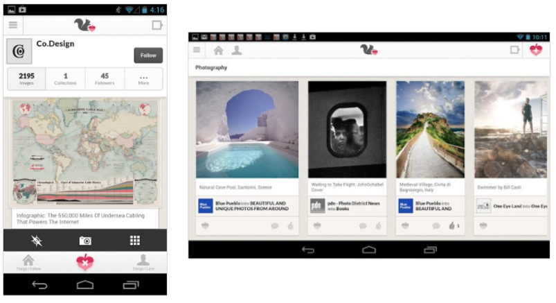
The greatest challenge faced by LoveIt as a business, was its striking resemblance to the very popular Pinterest UI. Despite some major functional enhancements and long sought-after features, that resemblance was a handicap that LoveIt could not overcome in it’s original form.The horizontal scrolling enhancement on iPads lead to a breakthrough design concept for the entire platform that relied on horizontal-based collections as opposed to the standard image waterfall. This new concept uses the same content but opens up bold new usage possibilities for content consumption, sharing and engagement.